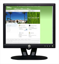
 In December 2008, our Better Homes and Gardens Real Estate Website reached its 6th month birthday. We decided this was a perfect time to take stock of our mission as a consumer centric brand and conduct a usability study to determine how on target we were with it. We also sought to discover if what we built back in July was meeting the needs of our customers and serving as a step forward for online real estate.
Our mission was clear. With a hefty to-do list of web enhancements for 09, we believed that putting up untested ideas and experimenting with them on the consumer was inconsistent with our brand. Granted, sometimes users don’t know what they want until you give it to them. Hence the study. That is the only prudent way to measure whether or not the new ideas we’ve hatched or the old established ones that have been around for awhile are found desirable or not.
Personally, having come from outside real estate, my experience assures me that this is the best approach possible and one that I face with both excitement and utter dread. After all, what if the one idea you’ve hung your hat on and championed turns out to be a dud? Well, I think, better learn that early on then let the dud linger.
While many broker sites choose to remain static year after year, due to the constant shift of the Web and the evolving needs of the consumer, we believed usability testing was a necessity that should be performed at least once a year and before any major redesign or enhancement.
The four main objectives we were hard-pressed to discover were:
- The ability of our target audience to get from point a to point b and discover what if any obstacles existed that prevented them from a seamless experience.
- Learn how the experience on our site compared to that of other comparable real estate broker web sites.
- Validate the ideas planned for 09 and weed out those that proved non beneficial to our end users.
- Learn what it is we don’t know or never even never considered.
So we preceded.
Step 1 – We hired the firm Answerlab to develop the screener, to recruit and compose the moderator guide, to conduct the focus group sessions and publish a full report back with their findings along with recommendations. We recruited on a number of variables including age, geography, stage of the real estate buying process, time spent online, experience with competitors, familiarity with the Better Homes and Gardens brand and whether or not they ever previously purchased a home. The thrust here was to source the next generation real estate consumer and validate whether our approach appealed to them in comparison to other typical real estate brand/broker web sites.
Step 2 – After recruiting a dozen subjects, Answerlab walked each of them through the site during one hour sessions. When we were crafting the moderator guide we were very careful not to force any of our subjects down any particular path but merely follow them, observe, ask questions and give them a push if they got stuck so we could have feedback on as much of the site as possible. The most exciting part of these sessions was our ability to conduct them all via Web Ex so that our web development company, BHGRE interactive marketing staff and anyone else who cared to view the sessions could do so remotely. (In the old days we would be sitting behind a 0ne-way glass panel).
Check out a snippet of the session below:
Takeaways
For starters, this exercise was invaluable substantiating some ideas, casting out others and keeping us far outside the vacuum we would have been operating in had we not performed it. In its entirely, it served to support our claim of being a consumer centric brand.
From the onset, we learned the following:
- You never can account for everything. – Perfection is not the name of the game with developing great web sites. Make sure your core functions work really well and the rest can be improved along the way as a web site is a living and breathing entity. It’s always a work in progress!
- Trust your gut. It’s usually right. Don’t get hung up in putting too much credence in numbers as sometimes they are more directional than absolute. If you interact with your audience frequently then you should be able to make the right decisions on their behalf.
- There is a tendency to lean towards more sophisticated features than users are really looking for. A case in point might be mapping and all the complexities real estate continues to build into it. While it appeals to the programmer or tech geek in all of use, the user seems to have little use for most of it. We found that user interactivity of the map on the search results page was almost nil. It was like they were looking at a painting.
- We learned that merging consumer needs with a brokers need to recruit agents on the same site created some unanticipated confusion. Several users in the group pointed to it on the home page as the first thing that caught their eye and immediately made them feel as if they were being solicited to become agents instead of being serviced as a consumer.
- A surprising and welcome reveal was the non issue of BH&G listings on our site. I was actually surprised but not one respondent cared that other brand listings were on our site. We have chosen a very broker friendly path to diverting our traffic but in their mind, they came to search homes. All homes. Not specifically ours.
- Users expressed some difficulty creating accounts, saving listings and fully interacting with their own account pages. Considering how prevalent creating Web accounts are we found this was tied to an overall hesitation about about creating a real estate account. We learned we need to better explain the benefits here, make it easier and assure the user that their privacy will not be infiltrated.
- The biggest takeaway of all is get them there they’ll love it. We learned that our site had a great deal to offer but some of it required discovery rather than being self evident. What good is having great features if no one knows they exist.
Getting prospective real estate buyers and sellers to your site is pointless if they can’t figure out what to do or where things are. When web development and marketing work symbiotically, and you occasionally partner with your end user, you end up with a winning formula.


